The 10 Best B2B Website Examples for 2025 June
June 3, 2025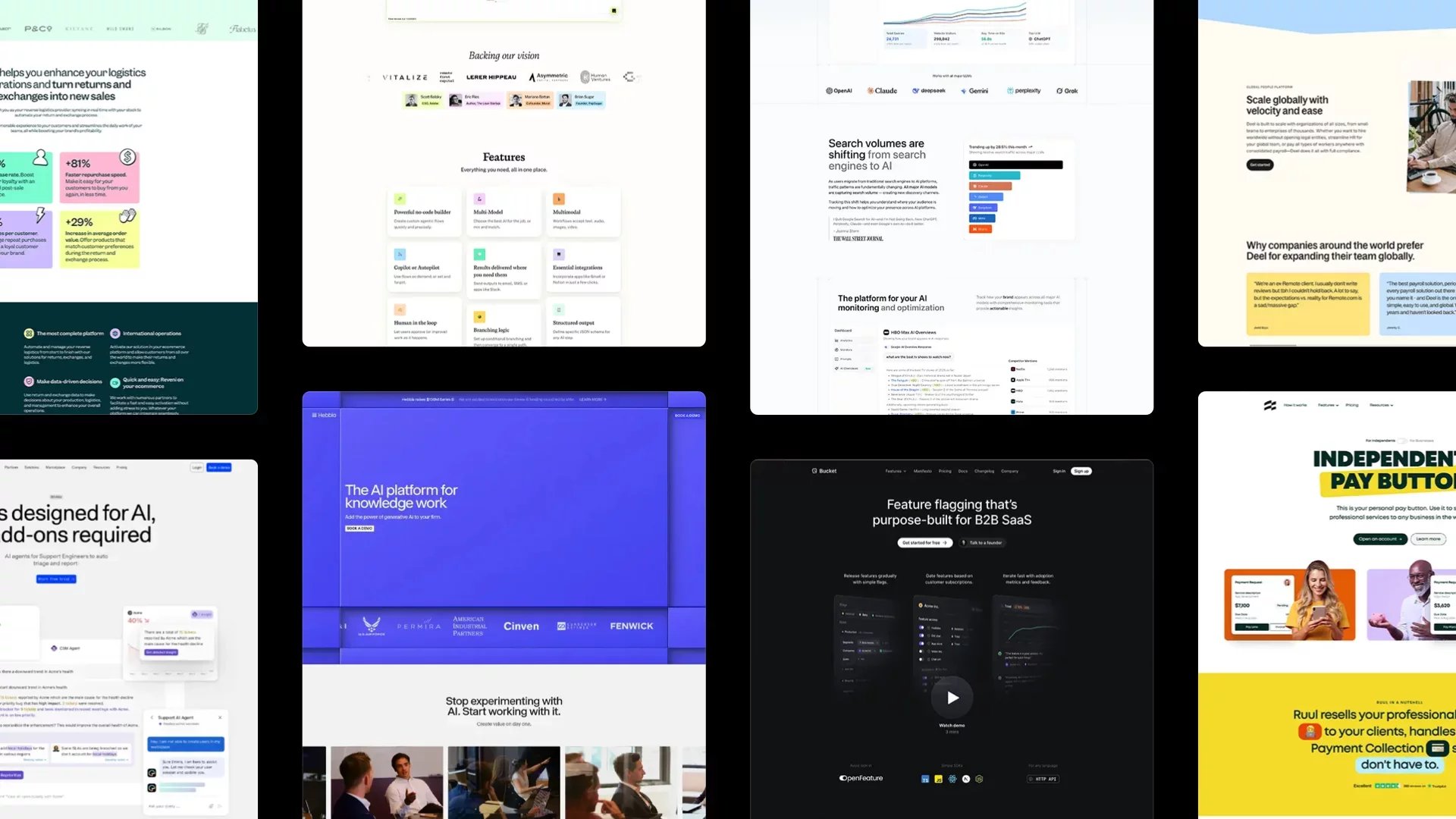
In the competitive world of B2B, your website isn’t just a digital presence—it’s your most valuable sales asset. A great B2B website design can build credibility, attract qualified leads, and convert visitors into long-term clients. In this post, we’ve curated the 10 best B2B websites of 2025 that stand out for their design, messaging, and performance.
Whether you're a SaaS company, consulting firm, or enterprise service provider, these examples will help you get inspired and stay ahead in the fast-evolving digital space.
The best B2B website designs
1. Hebbia
Hebbia’s website exemplifies a masterclass in aligning sophisticated AI technology with an intuitive and user-centric design, effectively catering to enterprise clients in finance, law, and corporate sectors.
Visual Identity and Messaging
The site employs a sleek, modern aesthetic with a dark-themed interface that conveys professionalism and innovation. Strategic use of whitespace and concise typography ensures clarity, while subtle animations guide users through complex information without overwhelming them. The homepage immediately communicates Hebbia's value proposition—transforming vast amounts of data into actionable insights—through compelling headlines and succinct subtexts.
User Journey and Navigation
Hebbia’s navigation is thoughtfully structured, segmenting solutions by industry—Finance, Law, and Corporate—allowing users to quickly find relevant information. The inclusion of a prominent "Book a Demo" call-to-action facilitates lead generation, while the clear delineation of product features and use cases supports informed decision-making.
Content Presentation and Clarity
The website excels in presenting complex AI functionalities in an accessible manner. Interactive elements, such as the M&A Deal Points table, demonstrate real-world applications of Hebbia's platform, enhancing user understanding. Consistent visual cues and structured layouts aid in digesting information, ensuring that content remains approachable for users across varying levels of technical expertise.
Overall, Hebbia’s website not only reinforces its brand as a leader in AI-driven enterprise solutions but also provides a seamless and informative user experience that effectively converts interest into engagement.
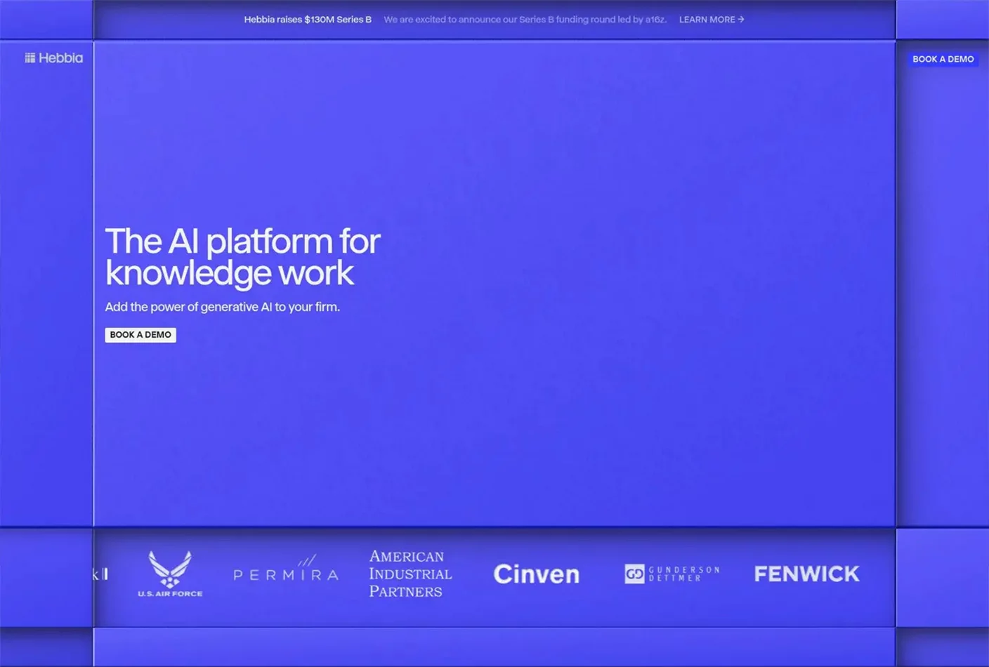
2. Bucket
Bucket’s website exemplifies a harmonious blend of developer-centric design and B2B SaaS functionality, tailored specifically for product engineering teams seeking efficient feature management solutions.
Visual Identity and Messaging
The site embraces a clean, Markdown-inspired aesthetic that prioritizes clarity and minimalism. Monochromatic tones, subtle animations, and precise typography communicate a sense of technical maturity while maintaining approachability. The homepage delivers a sharp value proposition—managing feature flags, user feedback, and product adoption—all in one streamlined platform.
User Journey and Navigation
Navigation is broken down by core functionalities—Flags, Feedback, Adoption—guiding users effortlessly through the platform’s capabilities. Each section is accompanied by focused copy and actionable CTAs like “Watch Demo” and “Sign Up,” optimized to drive engagement. Key integration highlights and developer tool compatibility help reinforce trust with the technical audience.
Content Presentation and Clarity
Bucket presents technical features in a digestible, modular format. Realistic code snippets, product UI previews, and use cases make the content relatable and easy to scan. Consistent spacing and structured layouts support fast comprehension, while the site’s focus on simplicity mirrors the product’s core philosophy.
Overall, Bucket’s website succeeds in building trust with engineering teams through its clear, focused design and carefully structured messaging, making it a strong example of B2B SaaS done right.
3. Ruul
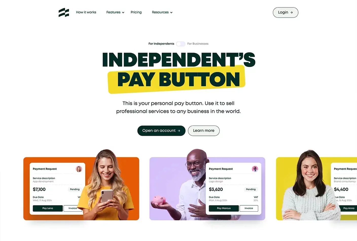
Ruul’s website presents a clean, modern design that clearly communicates its mission: simplifying global invoicing and payments for freelancers and businesses.
Visual Identity and Messaging
The site uses a minimalist layout with spacious white areas and bold, readable typography. Subtle color accents highlight key actions and reinforce brand clarity.
User Journey and Navigation
Navigation is intuitive, with dedicated sections for freelancers and businesses. Clear CTAs like “Open an account” ensure a frictionless experience from discovery to conversion.
Content Presentation and Clarity
Complex offerings like tax compliance and multi-currency payouts are presented through concise copy, visual aids, and client trust signals that enhance credibility.
Overall, Ruul delivers a streamlined user experience that balances simplicity with global professionalism—ideal for its target audience.
4. DevRev
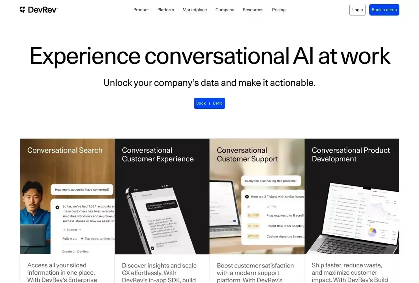
DevRev’s website blends futuristic design with a clear product narrative, positioning itself as an AI-powered platform for product and support teams.
Visual Identity and Messaging
The dark-themed layout with geometric accents signals innovation and precision. Bold headlines and purposeful animations communicate the platform’s focus on unifying dev and support workflows.
User Journey and Navigation
Navigation is clean and segmented by features—Search, Support, Build—making it easy for users to explore based on their needs. Calls to action like “Book a demo” are well-placed to drive engagement.
Content Presentation and Clarity
Complex AI-driven features are explained through clear visuals and real use cases. The structured layout and digestible copy help users understand benefits without friction.
Overall, DevRev’s site pairs technical depth with visual clarity—delivering an experience that feels both cutting-edge and easy to navigate.
5. Reveni
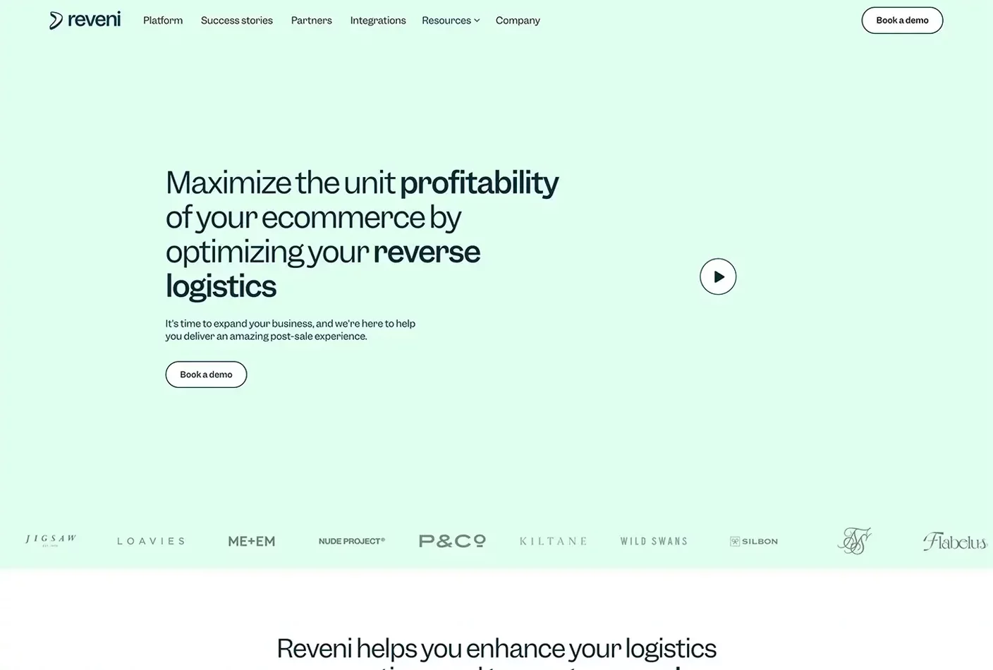
Reveni’s website delivers a crisp, modern experience that clearly positions its solution for eCommerce brands focused on post-purchase experiences like instant refunds.
Visual Identity and Messaging
The site uses soft gradients, minimalistic typography, and clean illustrations to establish a polished, trustworthy look. Messaging is concise and benefit-driven, quickly clarifying the product’s value.
User Journey and Navigation
Navigation is streamlined with focused sections for product, use cases, and results. Clear CTAs and minimal distractions guide users toward conversion with confidence.
Content Presentation and Clarity
Use of stats, client logos, and testimonial quotes build credibility. Complex logistics are broken down through simplified visuals and direct copy.
Overall, Reveni’s website strikes a strong balance between visual simplicity and high-impact communication—ideal for conversion-focused B2B SaaS.
6. Plumb
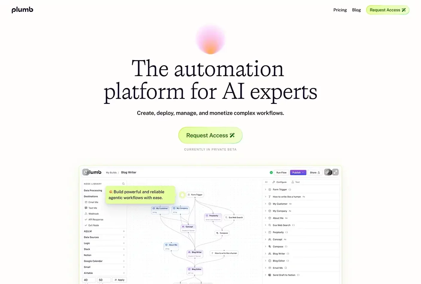
Plumb’s website delivers a sleek, developer-oriented experience that positions it as a powerful no-code platform for building and monetizing AI workflows.
Visual Identity and Messaging
The dark theme, geometric visuals, and bold typography reflect a technical, forward-thinking brand. Messaging is clear and focused on empowering users to design and deploy AI tools without code.
User Journey and Navigation
The structure leads users through key features—Design, Content, Publish—with smooth transitions and strong CTAs like “Request Access.” The layout supports fast comprehension and conversion.
Content Presentation and Clarity
Complex ideas are broken down through visuals, short copy, and a modular layout. The overall experience feels both polished and accessible.
Overall, Plumb’s site pairs visual sophistication with functional clarity—perfectly tuned for modern builders in the AI space.
7. Promptwatch
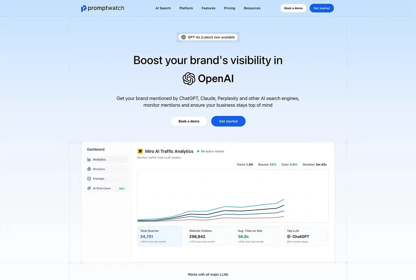
Promptwatch’s website delivers a sharp, analytics-driven experience tailored to brands optimizing their visibility across AI platforms.
Visual Identity and Messaging
The dark, modular design conveys technical precision. Headlines are clear and concise, emphasizing insights across tools like ChatGPT and Claude.
User Journey and Navigation
Users are guided smoothly through features like Monitors and Analytics, with CTAs like “Start 7-day trial” and “Book a demo” placed for high intent actions.
Content Presentation and Clarity
Interactive visuals and concise explanations make complex data easy to digest. Trust elements like client logos and stats support authority.
Overall, Promptwatch strikes the right balance between technical depth and usability—ideal for AI-first marketing and product teams.
8. Deel
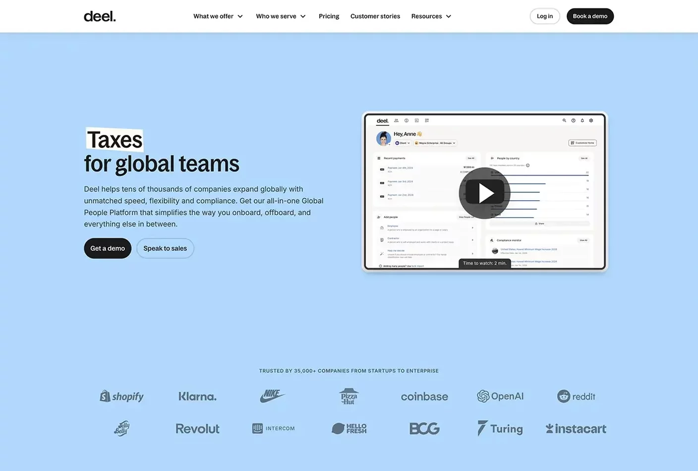
Deel’s website delivers a polished, enterprise-grade experience that reflects its leadership in global HR and payroll management.
Visual Identity and Messaging
The clean, structured layout paired with a neutral color palette signals professionalism and trust. Messaging is concise and focused on international hiring, compliance, and payments.
User Journey and Navigation
Navigation is clear and segmented by use cases and industries. Strong CTAs like “Book a demo” are consistently placed to drive engagement.
Content Presentation and Clarity
Information-heavy topics are broken into digestible sections supported by stats, testimonials, and clear visuals that build credibility and understanding.
Overall, Deel’s site balances clarity with scale—perfectly tailored for businesses managing global teams.
9. Cushion
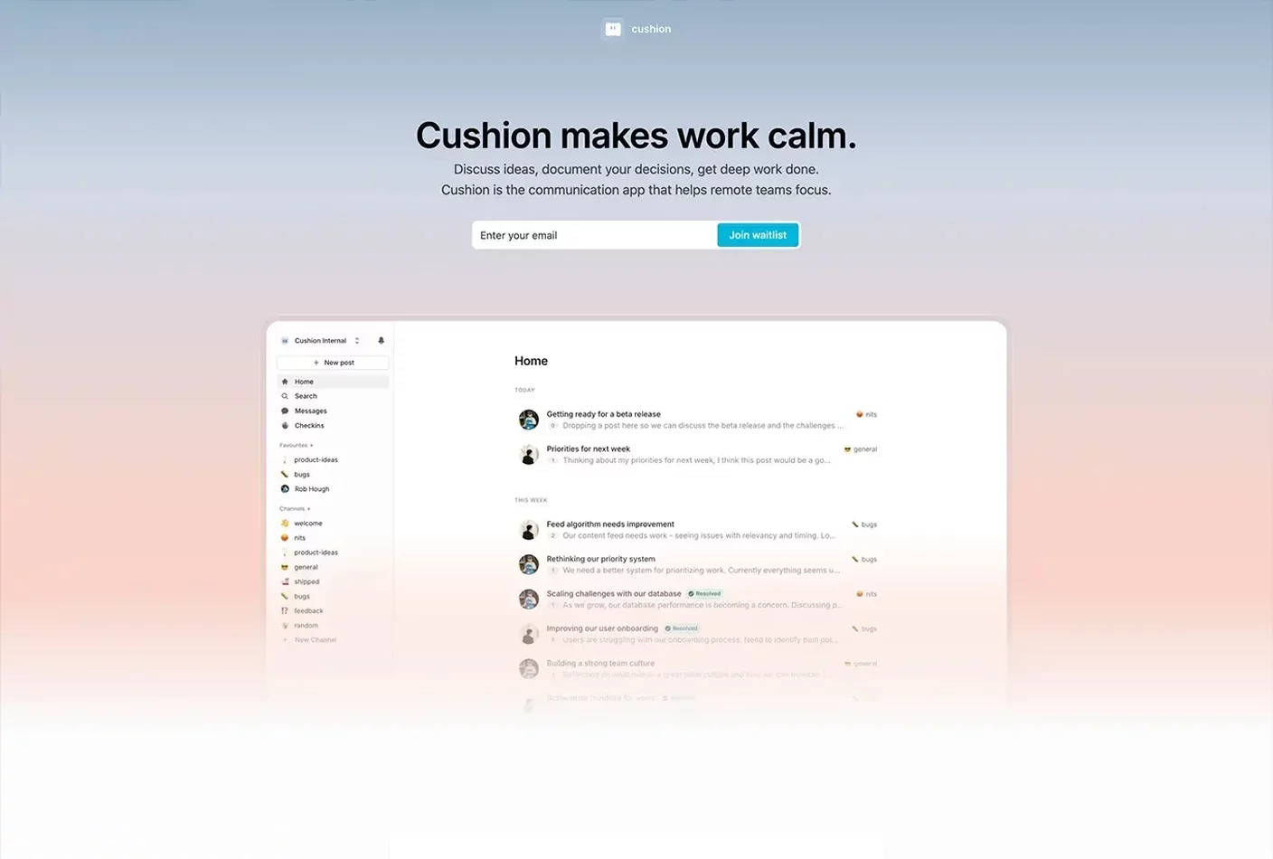
Cushion’s website presents a focused, minimal design that positions it as a distraction-free communication tool for remote teams.
Visual Identity and Messaging
The interface is clean and understated, using muted tones and structured layouts to emphasize clarity. Messaging is concise, highlighting features like async posts, decision tracking, and automated check-ins.
User Journey and Navigation
Navigation is straightforward, with clear sections for Posts, Decisions, and Check-ins. Calls to action like “Join waitlist” are strategically placed to guide user engagement.
Content Presentation and Clarity
Features are explained through concise copy and supportive visuals, making complex functionalities accessible. The emphasis on reducing noise and enhancing team focus is consistently reinforced throughout the site.
Overall, Cushion’s website effectively communicates its value proposition, offering a streamlined user experience tailored for remote teams seeking clarity and efficiency.
10. Monarch Money
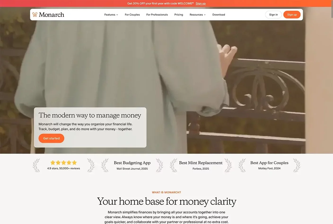
Monarch Money’s website delivers a sleek, consumer-friendly experience that positions it as a modern platform for personal and family finance management.
Visual Identity and Messaging
The design is clean and calming, using soft colors and spacious layouts to promote clarity. Messaging is direct, focusing on budgeting, goal tracking, and collaborative planning.
User Journey and Navigation
Navigation is intuitive, guiding users through key features like tracking, subscriptions, and shared accounts. CTAs like “Get started” are consistently placed and conversion-focused.
Content Presentation and Clarity
Financial tools are broken into simple, scannable sections with helpful visuals and user quotes that build trust and accessibility.
Overall, Monarch’s site balances simplicity with capability—ideal for users seeking control and clarity over their finances.
Looking for more B2B website inspiration?
Your website is often the first touchpoint for potential clients—make it a strong one. A well-designed B2B site builds trust, drives engagement, and turns visitors into long-term customers. Whether you’re redesigning or starting from scratch, let these examples guide you.
Explore our full gallery of B2B and SaaS website examples to discover what’s working in 2025—and what will set you apart.
