How to Get More Website Enquiries: 10 Proven Strategies
June 28, 2025
A website is more than just an online presence. For many businesses, it’s the single most important channel for generating enquiries and winning new customers. Yet, far too often, websites focus on aesthetics over function, failing to guide visitors toward making contact.
The reality is simple: people don’t magically fill out contact forms. You have to create a clear, trust-driven, and frictionless experience that encourages them to take action.
This guide breaks down ten essential strategies to help you get more enquiries from your website — practical, proven methods that apply whether you are a service provider, freelancer, consultant, or business owner.
1. Make Your Offer Instantly Clear
If a visitor lands on your website and cannot figure out what you offer within the first few seconds, you’ve lost them. Attention spans are short, and ambiguity costs leads.
How to get it right:
- Your homepage and every key landing page should open with a clear, specific headline that communicates what you do and who it is for. Skip vague or clever phrases. Clarity always wins.
- Follow with a concise subheading that reinforces the headline by describing how you help and why you are different.
- Eliminate clutter. Remove unnecessary animations, sliders, or stock phrases like “Welcome to our website.” Instead, use direct language that immediately answers the visitor’s question: Am I in the right place?
- Ensure the primary action you want users to take is obvious. Whether it’s “Get a Quote,” “Book a Consultation,” or “Schedule a Demo,” it should be visually prominent and unmissable.
- Keep navigation clean. Prioritize the most important links — services, about, contact, and perhaps a portfolio or case studies page.
Practical example:
Instead of “Innovative Solutions for Modern Businesses,” say “Web Design for Small Businesses — Fast, Affordable, and SEO-Ready.”
This level of clarity immediately tells the visitor whether they’re in the right place — and encourages them to stay.
2. Strengthen Your Calls-to-Action
Visitors need clear direction on what to do next. The mistake many websites make is hiding their calls-to-action (CTAs) or using weak, passive language.
Best practices for CTAs:
- Your primary CTA should be visible without scrolling. Place it in the header, hero section, mid-page, and near the footer.
- Use active, direct language that reflects the outcome the user wants. Instead of generic buttons like “Submit” or “Learn More,” use phrases like “Get a Free Quote,” “Check Availability,” or “Book Your Consultation.”
- Design buttons that stand out visually from the rest of the page. Contrast matters. If your site’s color palette is mostly blue, a bright orange or green CTA button draws the eye.
- Support your CTA with reassuring microcopy. For example, under the button, include phrases like “No obligation. Response within 24 hours.”
- On mobile, consider sticky CTA buttons that stay visible as users scroll. This significantly improves conversion rates for mobile visitors.
This is not about being pushy — it’s about reducing ambiguity. When a visitor understands exactly what step to take next, they are far more likely to engage.

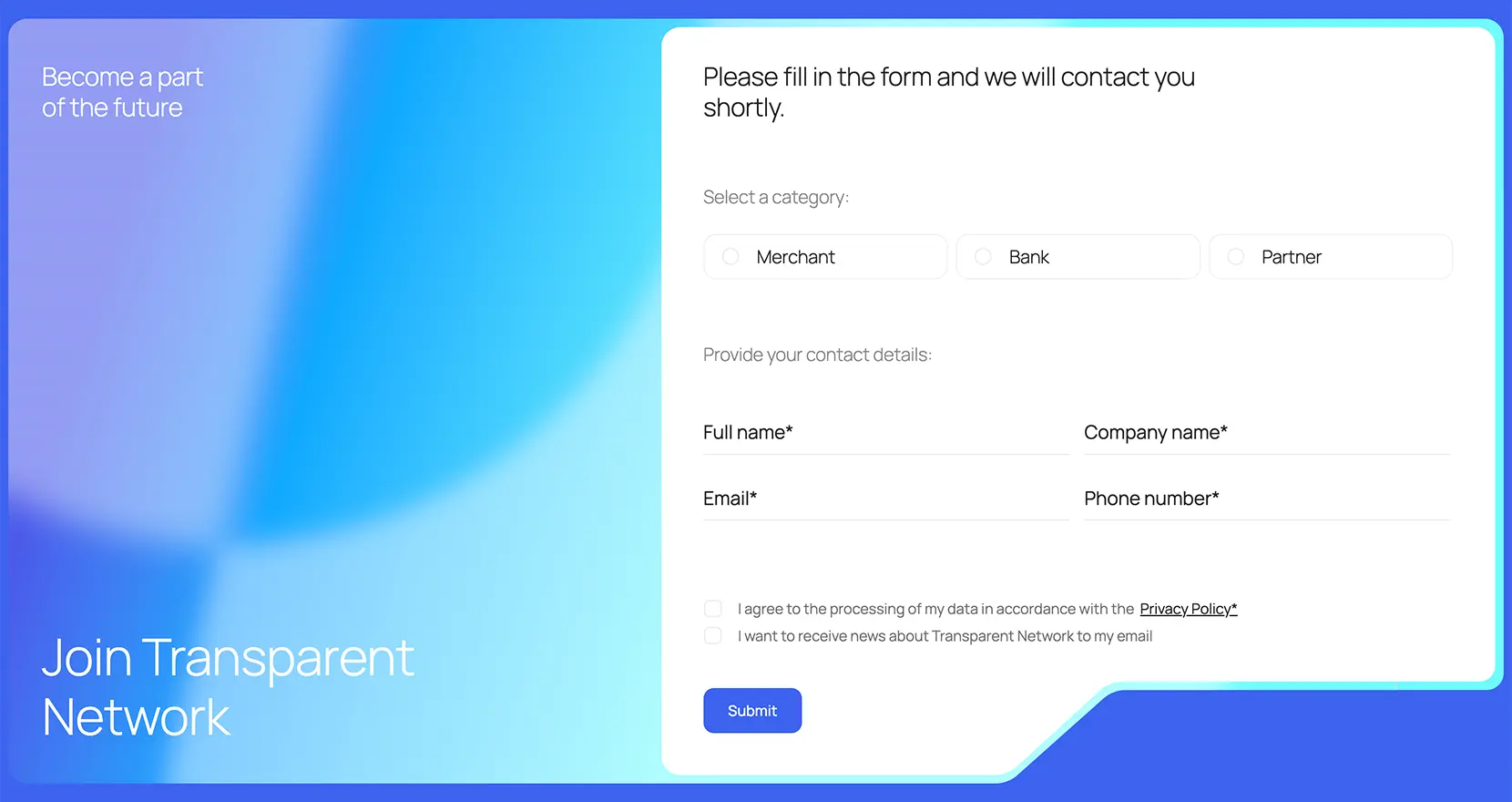
3. Simplify Your Contact Forms
Every additional field in a contact form increases friction. The truth is, most businesses ask for more information than they actually need to start a conversation.
How to simplify effectively:
- Start with the basics: name, email, and a message field. Ask for a phone number only if it is essential for your process.
- If you require detailed information — for example, project scopes or service preferences — consider using a multi-step form. Visitors are less overwhelmed when forms are broken into small, manageable steps.
- Add clear labels and microcopy that explains how their information will be used. Simple reassurance like “We’ll never share your information” or “Expect a reply within one business day” builds trust.
- Ensure forms are mobile-friendly. Use large input fields, avoid tiny dropdowns, and enable autofill wherever possible.
- Test the form experience yourself. Is it intuitive? Fast? Easy to complete on both desktop and mobile?
A simplified form removes barriers and makes the first step toward contact feel effortless.
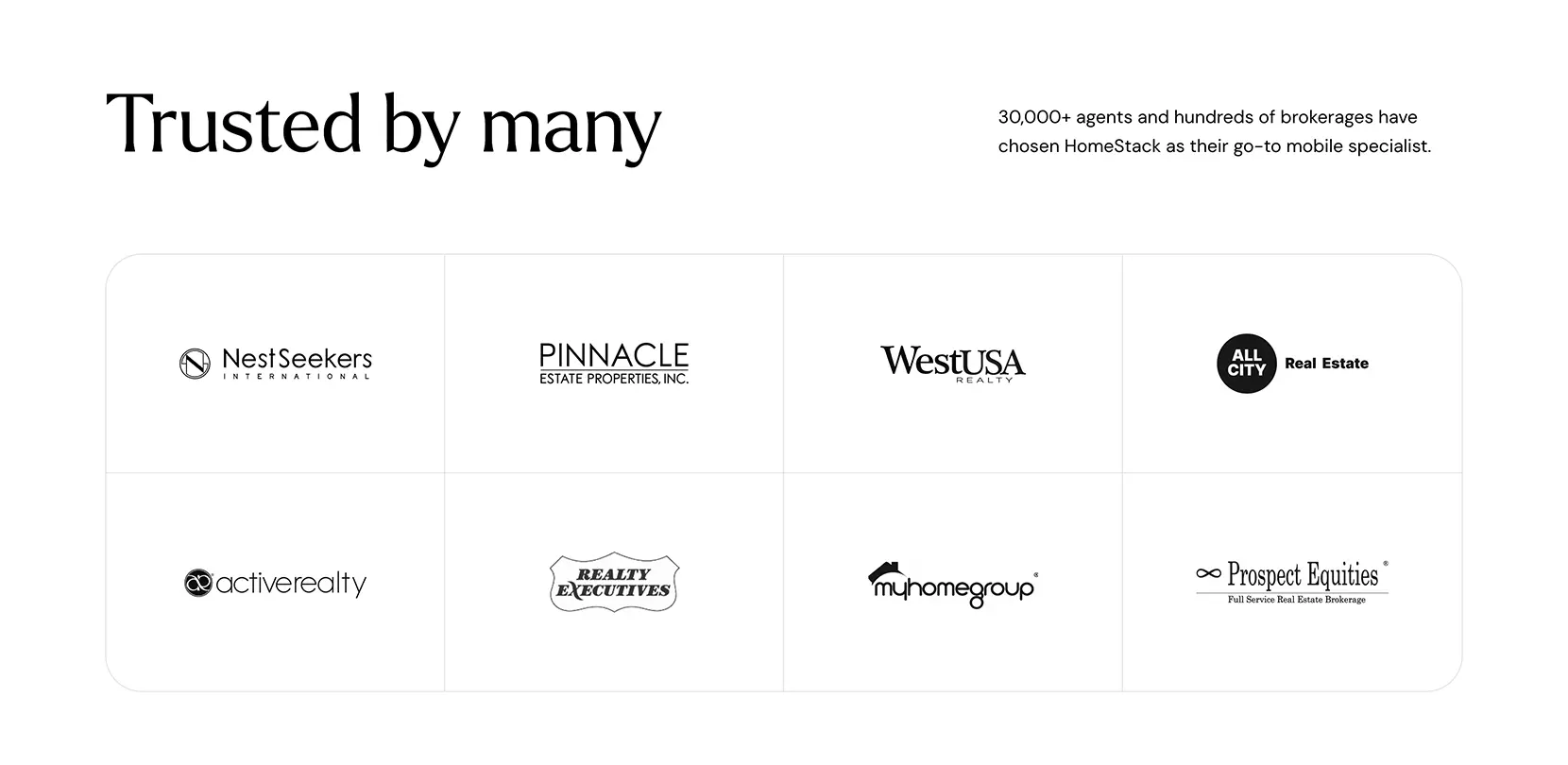
4. Build Immediate Trust With Social Proof
People are cautious online. They want to know if you are legitimate, reliable, and capable before they are willing to enquire.
How to build trust:
- Place testimonials strategically throughout the site — not just on a dedicated testimonial page. Position them next to CTAs, service descriptions, and contact forms where visitors are deciding whether to act.
- Use real names, photos, company names, and locations if possible. Generic or anonymous testimonials tend to be ignored.
- Showcase third-party reviews from platforms like Google, Trustpilot, or Yelp. Embedded reviews add credibility because they are verifiable.
- Include a portfolio or case studies that demonstrate results. Wherever possible, include before-and-after metrics, photos, or concrete outcomes.
- Display logos of companies or clients you’ve worked with (if permitted).
- Mention certifications, memberships, or awards that signal professionalism.
- Ensure your website has a valid SSL certificate (HTTPS). The padlock icon in the browser matters more than you might think for establishing legitimacy.
Trust is a prerequisite for enquiries. Without it, even the best CTAs will underperform.
5. Make Contact Options Obvious and Convenient
Some visitors prefer forms. Others prefer phone calls, messaging apps, or emails. If your website only offers one method of contact, you are losing potential leads.
How to improve accessibility:
- Place a phone number in the header, especially if phone enquiries are important to your business. Make sure it’s clickable on mobile.
- Use a persistent contact button on mobile devices that allows instant calling or messaging.
- Add live chat, WhatsApp links, or Facebook Messenger if real-time communication fits your business model.
- Every page, including service pages and blog posts, should either have a visible CTA or direct access to the contact page. Never assume visitors will navigate back to the top or main menu.
- The footer should include comprehensive contact information: phone, email, physical address (if relevant), and links to key pages.
- Make the contact process feel natural. Visitors shouldn’t have to search for how to get in touch.
Convenience leads to action. The easier you make it, the more likely visitors will reach out.
6. Prioritize Mobile User Experience
Mobile traffic often exceeds desktop traffic for most industries. A poor mobile experience directly translates to missed enquiries.
Key mobile optimizations:
- Use a responsive design that adapts fluidly to all screen sizes without manual zooming or horizontal scrolling.
- Ensure buttons and links are large enough to tap comfortably with a thumb, with sufficient spacing to prevent accidental clicks.
- Simplify mobile navigation. Avoid hidden menus or complex dropdowns that frustrate users on small screens.
- Optimize forms for mobile. Large input fields, autofill support, and minimal typing improve completion rates.
- Use sticky headers or bottom bars with quick-action buttons like “Call Now” or “Send an Enquiry.”
- Compress images and streamline scripts to improve mobile loading speeds, which directly impacts both user experience and SEO.
Test your website thoroughly on different devices and operating systems. Mobile optimization is no longer optional — it’s the expectation.
7. Improve Loading Speed
Speed matters — not only for search engine rankings but also for user experience. A slow website increases bounce rates and lowers conversion rates.
How to optimize speed:
- Compress all images using modern formats like WebP, which significantly reduce file sizes without sacrificing quality.
- Minimize the use of unnecessary plugins, especially on platforms like WordPress where plugin bloat is common.
- Use fast, reliable hosting. Cheap hosting often results in slow response times and downtime.
- Enable caching and use a Content Delivery Network (CDN) like Cloudflare to serve content faster across regions.
- Minify CSS, JavaScript, and HTML files to reduce load time.
- Implement lazy loading so that images only load as users scroll down.
Test your website regularly with tools like Google PageSpeed Insights and GTmetrix. Aim for load times under 2.5 seconds on both mobile and desktop.
8. Offer Value Before Asking for an Enquiry
Not every visitor is ready to get in touch immediately. Offering value upfront can convert uncertain visitors into warm leads.
Lead-generating value offers include:
- Free downloadable guides, templates, or checklists that help solve a problem related to your service.
- Free consultations or discovery calls, clearly framed as no-obligation.
- Instant quote calculators, where visitors can input information and get a ballpark figure without committing to a full enquiry yet.
- First-time customer discounts or limited offers.
- Educational resources like webinars, tutorials, or explainer videos.
This approach not only increases conversions but also builds credibility. Visitors feel they are getting something useful, which creates goodwill and trust.
9. Use Social Proof and Ethical Urgency
When used appropriately, social proof combined with genuine urgency can nudge visitors toward action.
How to implement:
- Display key business numbers: “Trusted by over 500 businesses” or “Serving clients in 10 countries.”
- Show recent activity with tools that highlight real-time enquiries or signups: “John from London just booked a consultation.”
- Use honest scarcity: “Only two project slots left for this month” or “Limited availability for our next workshop.”
- Display customer success stories prominently, reinforcing that others have benefited from your services.
The key is authenticity. False scarcity or manufactured urgency damages trust. Real examples, real numbers, and honest deadlines are persuasive.

10. Continuously Track, Test, and Improve
Improving enquiry rates is not a one-time task but an ongoing process.
Build a feedback loop:
- Use Google Analytics to understand which pages attract traffic but fail to convert.
- Implement session recording tools like Hotjar or Microsoft Clarity to watch how users interact with your site. Look for confusion, hesitation, or points where users abandon the journey.
- Set up conversion goals: clicks on buttons, form submissions, and phone number taps.
- A/B test different versions of headlines, button colors, CTA text, and form layouts to determine what performs best.
- Review enquiry quality as well as quantity. Are you attracting the right leads? If not, refine your messaging to better target your ideal customer.
A website that consistently improves its conversion rate compounds value over time — turning the same amount of traffic into significantly more business.
Conclusion
If your website is not generating the number of enquiries you expect, it is rarely just a traffic problem. More often, it is a conversion problem — one that is absolutely fixable.
Clear messaging, simplified forms, stronger calls-to-action, and better trust signals are not optional in today’s digital environment. They are the foundation of any website that aims to drive leads.
Apply these strategies thoughtfully, review your data regularly, and continue refining. Your website should be your hardest-working sales tool — one that quietly generates business for you every single day.
