10 Abandoned Cart Email Examples That Bring Shoppers Back
June 18, 2025
Running an ecommerce business isn’t just about great products and strong traffic—it’s also about recapturing revenue that slips through the cracks. One of the biggest leaks? Abandoned shopping carts.
In fact, over 70% of online shoppers add items to their cart only to leave without purchasing. That’s a huge chunk of potential revenue lost daily.
But here’s the good news: not all of those sales are gone for good.
With the right abandoned cart email strategy, you can win many of those customers back—and boost your revenue without increasing your ad spend. Whether you're running a Shopify store, WooCommerce site, or a custom ecommerce setup, abandoned cart emails are a low-hanging fruit you can’t afford to ignore.
In this post, we’ll break down what makes these emails work—and walk through 10 of the best abandoned cart email examples to inspire your own strategy. You'll learn how brands use humor, urgency, discounts, and personalization to recover lost sales and build customer loyalty.
Let’s start with the basics.
What is an Abandoned Cart Email?
An abandoned cart email is a follow-up message sent to a shopper who added products to their cart but didn’t complete the purchase. It’s a friendly, timely reminder that encourages them to come back and finish the checkout process.
Sometimes people get distracted. Sometimes they need a little push—like a discount, a product review, or a nudge that their favorite item is about to sell out. That’s where cart recovery emails shine.
💡 According to Klaviyo, cart recovery emails generate the highest revenue per recipient of any email flow—averaging $3.65 per email sent. When you multiply that by hundreds (or thousands) of abandoned carts per year, the upside is clear.
These emails typically include:
The items left in the cart (with images)
A direct call-to-action (CTA) to resume checkout
Optional incentives like discounts or free shipping
Social proof such as reviews or guarantees
A tone that matches your brand—funny, helpful, or urgent
Best of all? With modern email marketing tools, you can automate this entire process—triggering abandoned cart emails just minutes after someone leaves your store.
Why Abandoned Cart Emails Work (and What Makes a Great One)
Abandoned cart emails aren’t just reminders—they’re recovery machines.
They work because they tap into a moment of intent. The shopper already showed interest. They browsed, clicked, and even picked out products. Something stopped them from completing the purchase—but often, it wasn’t a firm “no.” It was a distraction, a question, or just bad timing.
Here’s why the best cart abandonment emails bring people back:
1. Timing is everything
The first hour after someone abandons their cart is the sweet spot. Studies show sending an email within 60 minutes can recover up to 16% of lost sales. Follow-up emails a day or two later can capture even more. That’s why most high-converting strategies use a 3-email sequence:
1st email: 1 hour after abandonment
2nd email: 24 hours later
3rd email: 72 hours later
2. They show what’s left behind
People forget. Showing the exact items they left in their cart—complete with product images, prices, and sizes—makes it easy to resume the checkout process in one click.
3. They lower friction
Great emails remove the blockers that stopped someone from buying. This might be offering a discount, highlighting free returns, or clarifying shipping times. Every answered question builds confidence.
4. They create urgency
Phrases like “Going fast,” “Selling out,” or “We’re holding this for you” use the psychology of scarcity to nudge buyers back.
5. They match the brand voice
Whether it’s playful and fun or sleek and minimal, the best emails feel like they’re coming from the same brand you browsed. This builds trust and familiarity.
6. They use social proof
A few customer reviews, star ratings, or testimonials can make a big difference. Knowing others love a product builds confidence for hesitant shoppers.
7. They feature a strong call-to-action (CTA)
A single, clear button—like “Return to Cart” or “Finish Checkout”—keeps things simple. Confused shoppers don’t convert.
Best Abandoned Cart Email Examples That Actually Work
Revival
Subject line: Still thinking about it?
Revival sends this thoughtful reminder to nudge shoppers back to their cart. The email opens with the friendly headline “Still thinking about it?” followed by a reassuring line: “You picked a standout.” It’s a confidence boost that makes the shopper feel like they have great taste—and subtly implies the item could sell out.
The product image takes center stage, reminding customers of exactly what they left behind. Below it, a clear CTA button—“Take Another Look”—makes it easy to return to the product page and continue the purchase.
What makes this abandoned cart email stand out is its added support option. A second section invites hesitant shoppers to get free design help. Whether they’re unsure about size, color, or budget, Revival offers a helpful nudge with the CTA “Get Design Support.”
This kind of added value lowers friction and addresses common barriers to buying—without relying on discounts.

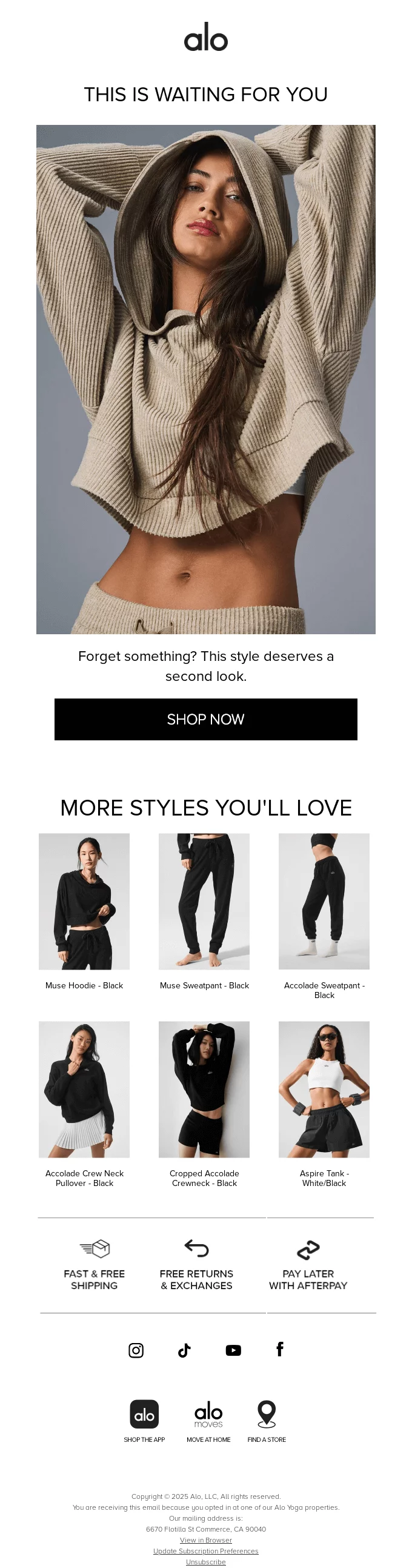
Alo Yoga
Subject line: This is waiting for you
Alo Yoga’s abandoned cart email keeps it sleek and fashion-forward, just like its brand. The email leads with a high-impact image and a bold header: “This is waiting for you.” It’s a subtle but effective nudge—short, confident, and on-brand.
Below the main image, the copy reads: “Forget something? This style deserves a second look.” It’s soft, friendly language that avoids pressure while still encouraging the customer to revisit the item.
What makes this email work is the seamless blend of aspirational visuals and smart product recommendations. The second half of the email showcases “More Styles You’ll Love,” helping users discover similar products they might prefer or want to bundle.
Alo also builds trust and urgency with simple icons highlighting key benefits: Free shipping, free returns, and buy now, pay later options via Afterpay. These value props remove common barriers to purchase without cluttering the design.
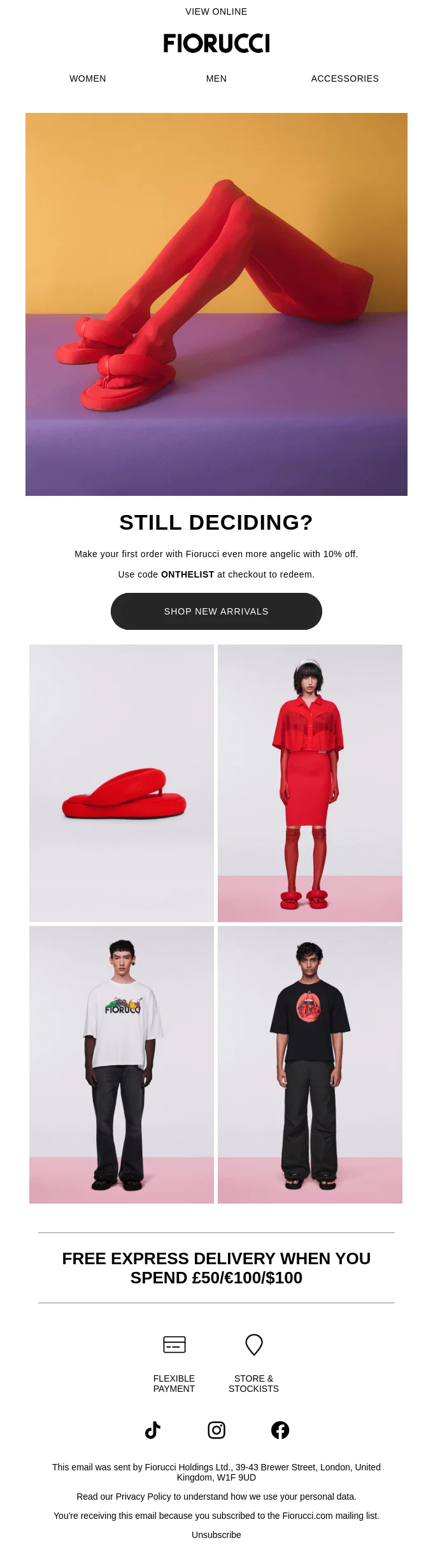
Fiorucci
Subject line: Still deciding?
Fiorucci’s abandoned cart email grabs attention with high-fashion visuals and bold, minimalist messaging. The headline “Still deciding?” cuts straight to the point, and the copy sweetens the deal with a 10% discount on your first order using the code ONTHELIST.
The email maintains the brand’s signature style—clean design, bold color, and editorial photography. It makes the customer feel like they’re part of something cool, not just completing a forgotten transaction.
Below the CTA, Fiorucci includes a grid of trendy product images to inspire a second look. Combined with the free express delivery offer on orders over a certain threshold, the email balances style and incentive effectively.
It's a great example of how to use discounts, urgency, and fashion-forward visuals in one elegant message.
Kizik
Subject line: Keep that momentum going
Kizik’s abandoned cart email stands out with bold typography and a motivating headline: “KEEP THAT MOMENTUM GOING.” It’s a clever way to build on the energy of the customer’s shopping intent, encouraging them to complete their purchase without missing a step.
The hero image highlights the exact product left in the cart—Men’s Oslo - Lyons Blue sneakers—and is followed by personalized copy:
“Don’t worry—you’re almost there. You’re one click away from bringing these Kiziks home.” This kind of encouraging tone works well, especially for customers who just needed a small push.
The follow-up visuals lean into Kizik’s unique selling point—hands-free shoes—with the statement “NO HANDS HERE” and real-life lifestyle imagery of stepping into the shoes. It’s a subtle but effective reminder of the product’s convenience.
The email finishes with a strong CTA—“CHECKOUT NOW”—and a bold branded footer that mirrors the brand’s energetic, modern tone.


Browse the full collection
Discover even more creative and high-converting email designs.
Sonos
Subject line: Like what you see?
Sonos takes a clean, product-focused approach with their abandoned cart email. The subject line—“Like what you see?”—leads into a simple but clever follow-up: “You’ll like it even more when you listen.” It’s a smart reminder of the product’s true value—something that can only be fully appreciated when experienced.
The email highlights the specific item left behind—the Move 2 speaker—paired with a sleek, high-contrast image. Rather than using urgency or discount tactics, Sonos leans into confidence and ease:
“Shop now, pay later” with Klarna
“Try it for 45 days” risk-free
24/7 support and direct phone/chat links
These reassurances eliminate friction for hesitant buyers. The message is clear: there’s no pressure—just a high-quality product and a hassle-free buying experience.
Sonos also includes a sustainability note near the bottom: “Sonos doesn’t play when it comes to the planet.” It’s a subtle yet strong brand-building element that aligns with eco-conscious shoppers.

Lamborghini Wines
Subject line: Still thinking?
Lamborghini Wines delivers luxury and persuasion in one clean, elegant abandoned cart email. It starts with a bold headline—“Still thinking?”—followed by the comforting subtext: “Don’t worry, we’ve got you.” This sets a relaxed and confident tone, aligned with the premium branding.
Rather than showing the specific item left behind, the email pivots to a helpful, customer-focused question:
“Having trouble picking the perfect wine?” Then it invites the shopper to share preferences—especially useful if the purchase was intended as a gift.
Below that, the email smartly pivots into curated suggestions: “Here’s Some of Our Best Sellers.” Featuring a beautifully photographed grid of gift-ready wine sets, each block includes a high-quality image, product name, and sleek “Shop Now” CTA. It’s part product reminder, part product discovery.
With its refined visuals, strong hierarchy, and helpful guidance, Lamborghini creates a luxurious follow-up experience that respects the customer's time and style.

Echo
Subject line: Hey, water you waiting for?
Echo grabs attention immediately with a clever pun and bold copy. The subject line—“Hey, water you waiting for?”—is playful and memorable, while the follow-up line, “You left the ultimate hydration solution hanging,” sets the stage for an energetic, persuasive reminder.
The email highlights the product left behind—Echo Flask Hydrogen Water Bottle ($299.99)—with a futuristic, glowing product image and a clear “Return to Cart” CTA.
But what makes this email especially effective is the use of benefit-focused storytelling. The second section breaks down what the customer is missing by walking away:
Boosted energy
Better workout recovery
Improved skin
Mental clarity
Overall wellness
It even includes a 5-star testimonial from a customer who credits the product with major health improvements. This adds powerful social proof and emotional validation.
Echo closes with another friendly reminder—“Don’t leave a good thing behind, friend”—and repeats the CTA, reinforcing the action without pressure.

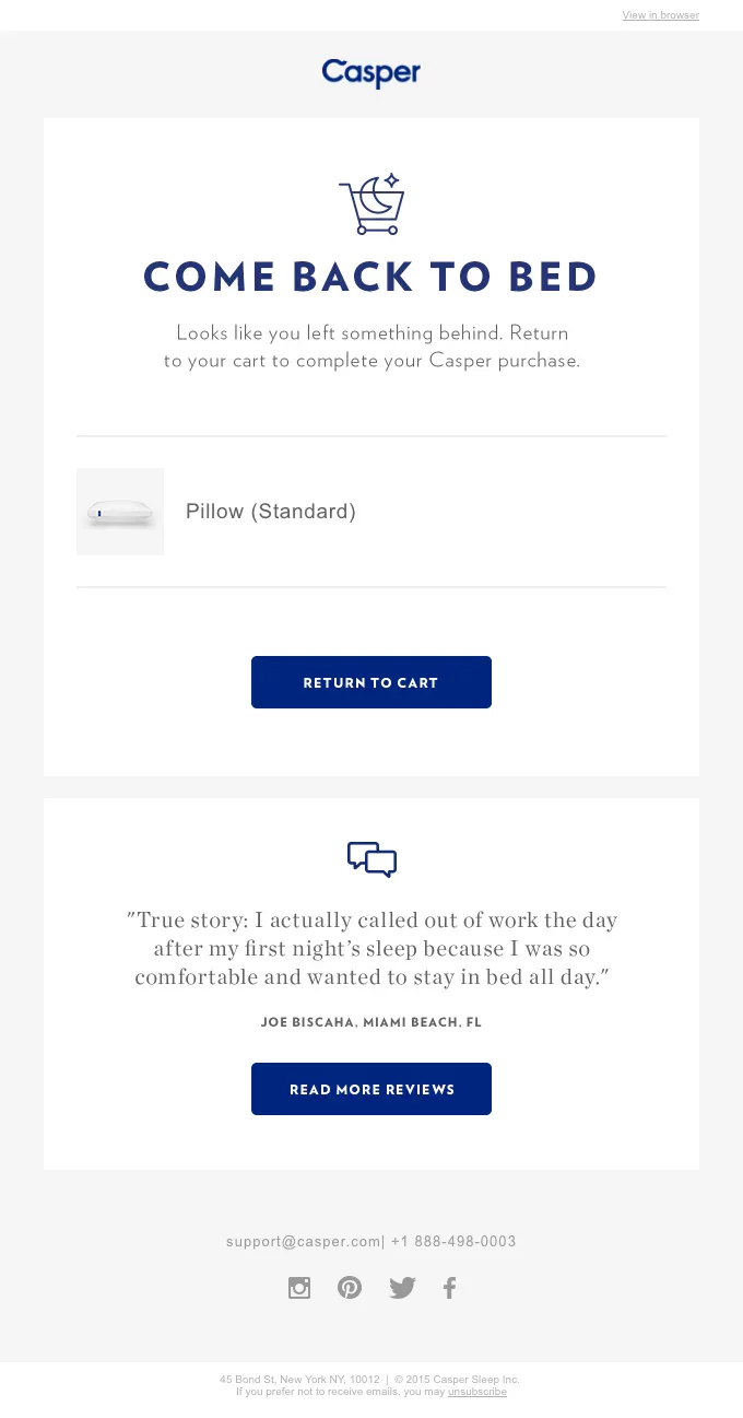
Casper
Subject line: Did you forget something?
Casper’s abandoned cart email is a classic example of on-brand, high-converting simplicity. The email leads with the playful yet on-message headline: “COME BACK TO BED.” It’s warm, direct, and perfectly aligned with their sleep-first positioning.
The message reinforces that something’s been left behind—in this case, a Standard Pillow—with a soft reminder to return to the cart and complete the purchase. A strong “Return to Cart” CTA follows, helping users jump right back into the checkout flow.
What makes this email effective is the inclusion of a relatable customer review:
“I actually called out of work the day after my first night’s sleep because I was so comfortable and wanted to stay in bed all day.”
This adds a dose of humor and social proof—reminding shoppers not just what they left behind, but why others love it too.
Rudy’s
Subject line: Don’t let free shipping go to waste
Rudy’s takes a witty and relatable approach with its abandoned cart email. The bold headline—“DON’T PUT THIS OFF LIKE A SOFTWARE UPDATE”—immediately grabs attention and taps into a familiar procrastination habit. It's funny, human, and highly effective at re-engaging distracted shoppers.
This email is all about urgency and incentive. A yellow alert bar at the top warns: “Your free shipping is about to expire.” The copy that follows reminds shoppers their cart may not last long—and that they can still complete their purchase and save with the promo code SMLSDVS.
The email lists the exact products left behind, including images and quantities, which makes it easy for shoppers to resume checkout. A bold “CHECKOUT NOW” button brings it all together.
This is a strong example of how to use humor, timing, and urgency to win customers back—without discounts that devalue the product.

Nomad
Subject line: What happened?
Nomad takes a clever and casual approach to reconnecting with hesitant shoppers. The headline—“What happened?”—is followed by a playful question: “Did your Wi-Fi crash?” It assumes a technical hiccup rather than buyer hesitation, helping the customer save face while gently nudging them back.
The message quickly reassures: “We saved that shiny Nomad product you were just ogling.” This keeps the tone friendly and personal—almost like a helpful friend stepping in to remind you where you left off.
The design is sharp and minimal, with bold CTA buttons like “Seal the Deal” and “Checkout” placed prominently. The product image (a sleek black AirPods case) keeps things visual and streamlined.
What seals the deal is the reassurance at the bottom: Nomad reminds shoppers that all purchases come with a 30-day return policy and 2-year limited warranty—addressing any last-minute doubts without using discounts.

Final Thoughts: What These Abandoned Cart Emails Teach Us
The best abandoned cart emails don’t just remind shoppers—they re-engage them. Whether it’s a witty subject line, a tempting discount, a glowing customer review, or a simple, well-timed nudge, these brands show that recovery emails can do more than just chase a lost sale—they can build trust and deepen customer loyalty.
Here’s what we’ve learned:
Timing matters—send your first email within an hour for best results
Visual reminders of cart items boost conversions
Copy that’s funny, personal, or empathetic gets opened and clicked
Social proof and guarantees reduce buying hesitation
Clear, bold CTAs remove friction
Most importantly, great abandoned cart emails feel like part of the brand—not a generic follow-up. From Revival’s design support to Echo’s science-backed testimonials, each email reflected the personality of the product it was selling.
So if you're building your own email recovery flow, start by learning from the best—then test, refine, and make it your own.
Browse the full collection
Want more examples? Discover even more creative and high-converting email designs across different industries and flows.
yearly subscription